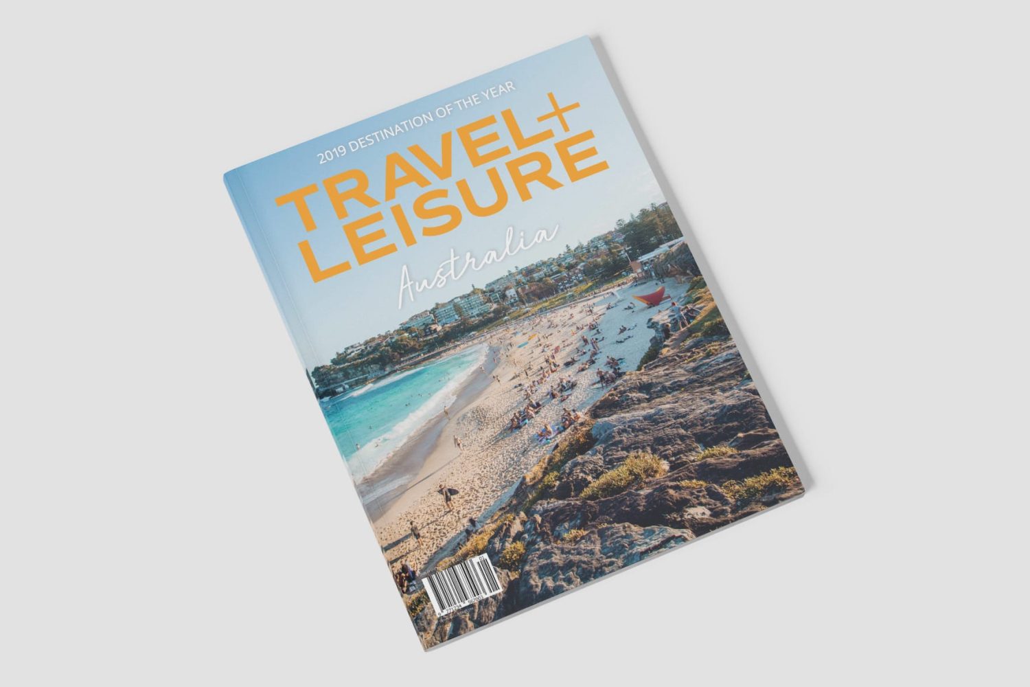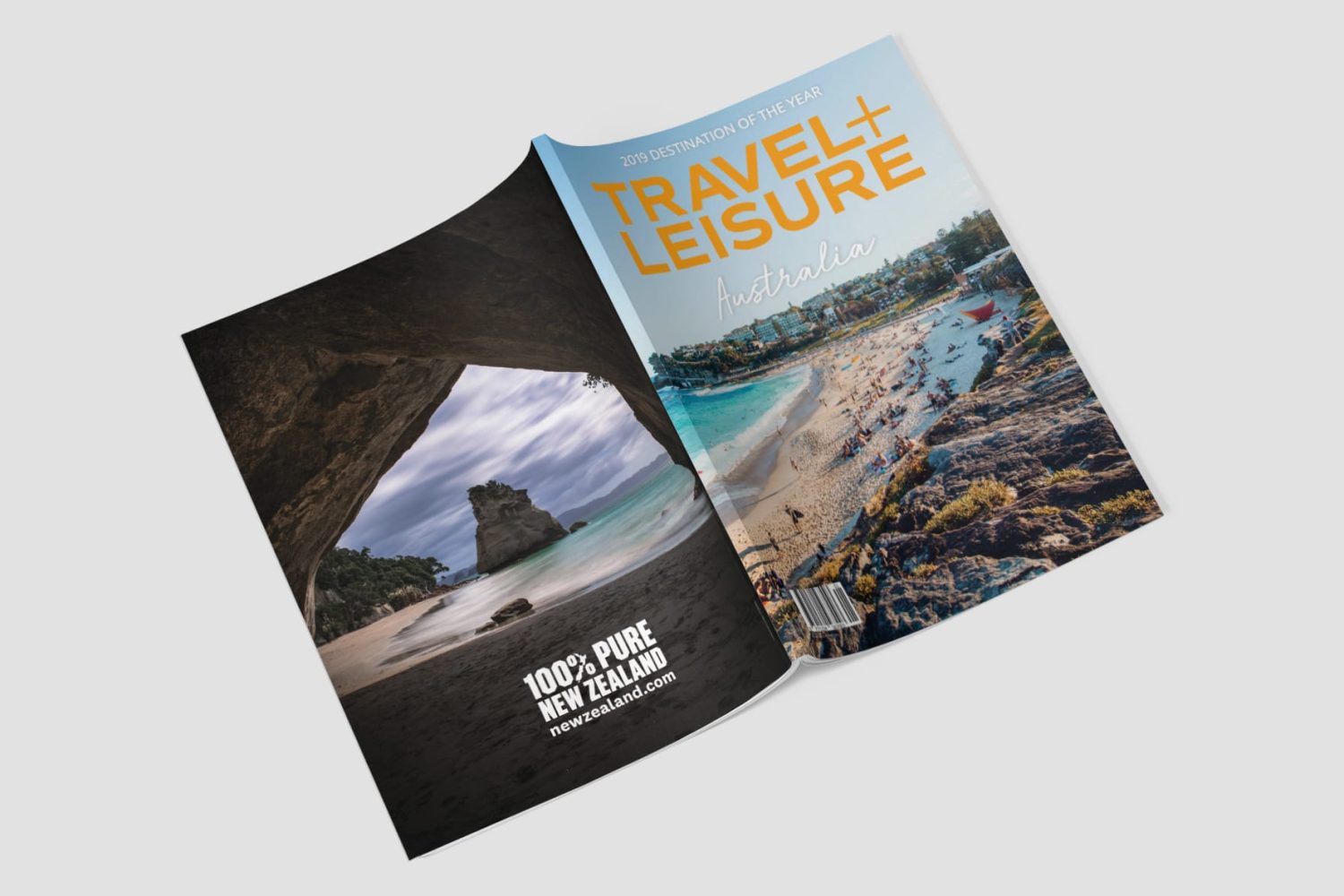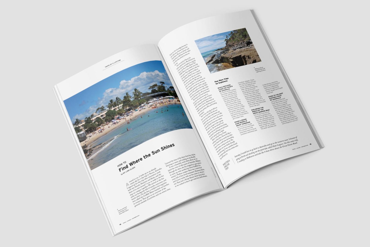

To prepare for a portfolio review, I redid an old project. I wrote an article and designed a magazine spread to explore publication design.

Travel + Leisure Magazine Spread
Travel + Leisure, founded in 1937, is renowned for its in-depth articles on leisure travel, often penned by creative voices like novelists and designers. For a portfolio review, my professor asked us to revise a previous project. I selected a magazine spread I had created on the band LANY, as I felt the original layout was too simplistic and wanted to push my creative boundaries. Keeping Travel + Leisure’s style and audience in mind, I reimagined the spread to reflect the magazine’s brand, completing the redesign in two weeks.
I designed a magazine spread using my own writing and photography to commemorate my study abroad experience in Gold Coast, Australia, during spring 2019, aligning with Travel + Leisure’s storytelling style. I chose the typeface Commuter Sans for its compatibility with their aesthetic, along with Open Sans, Run Wild, Interstate, and Adobe Caslon Pro. Interior photos are my own, while exterior imagery came from Unsplash. Based on professor feedback, I added front and back covers and adjusted the drop cap ‘A’ from black to light gray to enhance the design.
The final design aligns with Travel + Leisure’s brand through thoughtful content and a clean layout. Attention to detail—adjusting kerning, font size, leading, and line spacing—helped create a polished, magazine-ready spread.