
Universal Declaration of Human Rights
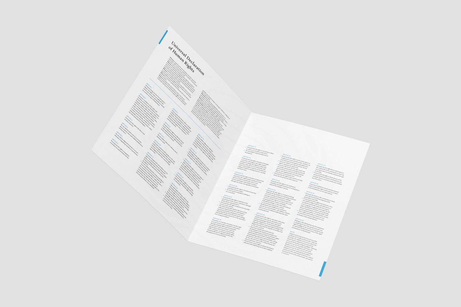
This exercise in typography class focused on applying formatting tools in InDesign. Our professor provided a Word document containing the Universal Declaration of Human Rights, and the task was to analyze, design, and format it into a polished layout.
I researched several typefaces and chose Classica Pro for its timeless, readable design, while using Avenir for subtitles and paragraph numbers to maintain clarity and simplicity. I broke the text into smaller paragraphs and used white space for better readability. The body copy was set at size 8 to balance legibility with ample white space. I first designed the entire layout in grayscale, focusing on text formatting. Once the layout was finalized, I added blue to emphasize layout and text hierarchy before making additional design choices.
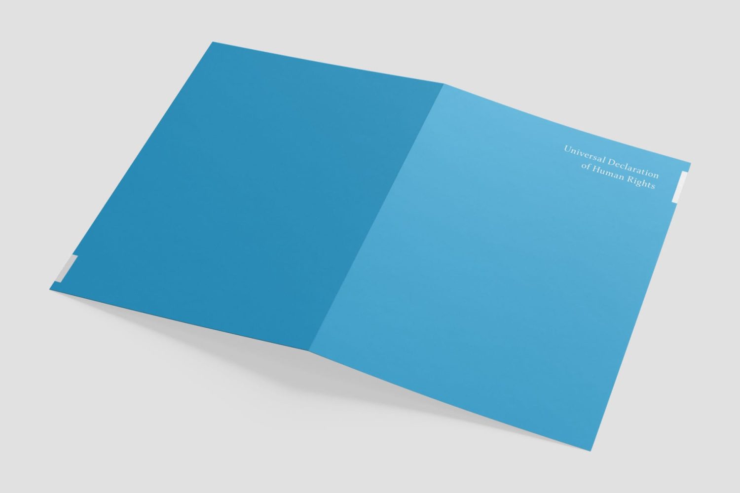
My goal was to make the copy more approachable and less overwhelming for viewers. During a portfolio review, a Morsekode creative director praised my typography skills, noting that working with small type is a craft. He also commended my professor for assigning this project, highlighting how it teaches attention to detail in typography. One additional suggestion was to design a front and back cover to provide readers with immediate context.